An inspiring podcast on everything you need to know about color!
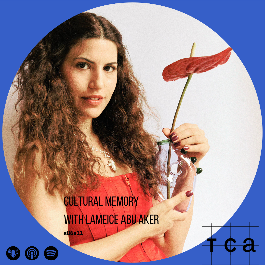
S6E11 Cultural Memory with Lameice Abu Aker
Jerusalemite designer Lameice Abu Aker creates at the intersection of emotional resonance and cultural memory, exploring how form, color, and material embody the poetry of domestic rituals. Now based between Jerusalem and Milan, where she earned her Master’s in Furniture Design from Politecnico di Milano, her work fuses Mediterranean nostalgia with sculptural whimsy.
In 2021, she founded Ornamental by Lameice, a studio dedicated to glassware that blurs the line between sculpture and tableware. Collaborating closely with a family of artisans in the Palestinian village of Jaba’, where glassblowing is a centuries-old tradition, Lameice introduced an unprecedented palette of pastel hues and whimsical designs as an entirely new chromatic language within their heritage of earth and fire.
Each piece is shaped without molds or mechanical constraint, allowing the molten glass to reveal its own peculiar grace. The artisan’s breath lingers in every curve; light, once captured, seems reluctant to leave.
Drawn to the table as a stage for life’s theatre, Lameice designs vessels that hold moments of dates, spirited debates, and family stories in awkward elegance, unexpected colors, and playful forms that carry optimism, intimacy, and the sense that the object might be a character of its own.
Her collections Dreamlike, Eye Candy, and Teta Edition have been exhibited internationally from Paris and London to New York, Singapore and Monaco, each piece a small ambassador of whimsy, heritage, and light.

S6E09 Modular Color with Sofia Ilmonen
This first autumn podcast episode features Finnish fashion designer Sofia Ilmonen, who discusses her approach to creating modular, transformable garments that can be reshaped and reassembled like building blocks. Ilmonen details how her use of simple square or rectangular modules contributes to her sustainability goals. She also explains her focus on "sizeless" garments aiming to increase longevity by addressing the poor fit, which she identifies as one of the biggest reasons for discarding clothing.
Sofia Ilmonen is a fashion designer whose work centres on modular, transformable clothing that merges sustainability with innovative garment design. At the core of her concept is adaptability — both in silhouette and size — with the aim of promoting a more responsible and inclusive fashion culture. The modular approach extends garment lifespans by allowing pieces to be reassembled and reshaped endlessly.
All garments are built from square-shaped modules, a form that not only follows zero-waste cutting principles but also embodies the idea of continuous design. Each module is compatible with any part of a garment and is joined using a unique system of specially designed 3D-printed buttons. This enables infinite transformations without sewing and makes the garments sizeless, adaptable to many body shapes and styles.
Sofia’s work has been presented in international exhibitions and featured in publications such as British and Scandinavian Vogue. Her Aalto University thesis was recognized with the Marimekko Award and the Finnish Textile and Fashion Prize, and she received the prestigious Mercedes-Benz Sustainability Prize at the Festival de Hyères. Her modular collections have also been showcased at Berlin and Copenhagen Fashion Weeks.
Before founding her own label, Sofia worked extensively in London in roles ranging from seamstress and creative pattern cutter to designer. Her three years at Alexander McQueen, immersed in the world of high fashion and craftsmanship, left a profound influence on her design philosophy and continue to shape her practice today.
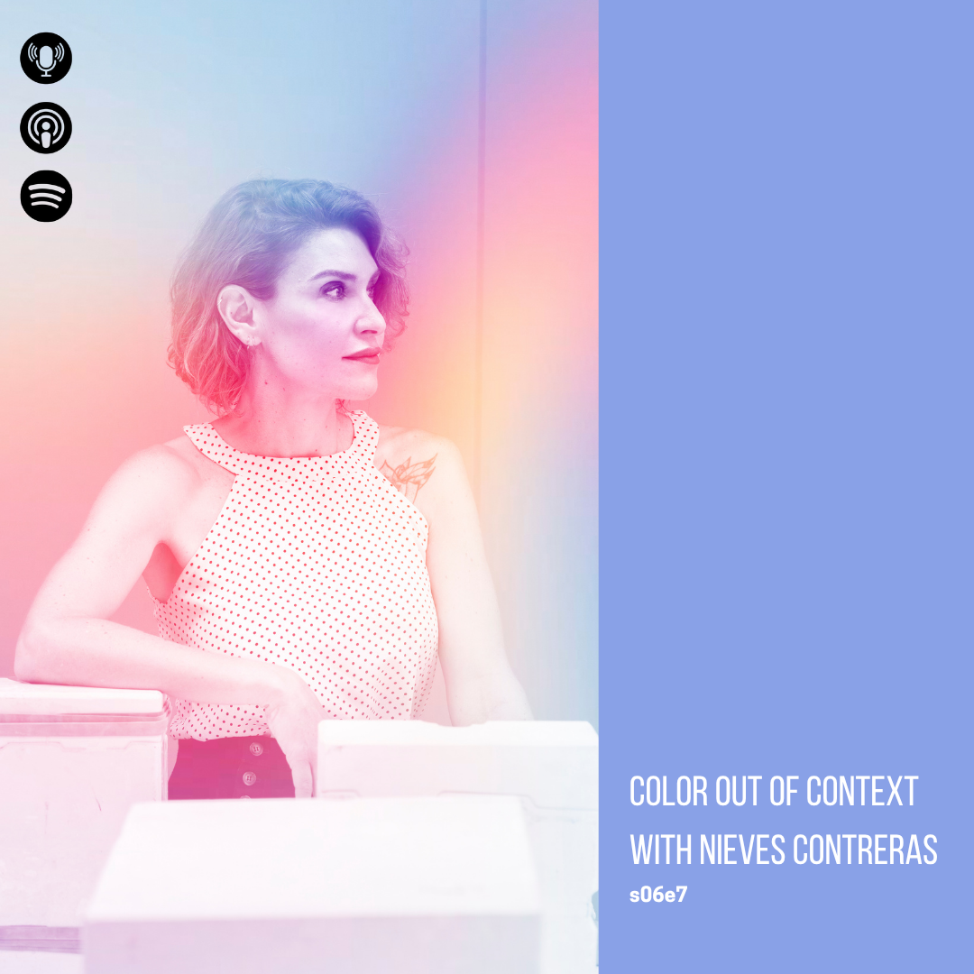
S6E07 Color Out of Context with Nieves Contreras
Nieves Contreras talks about what inspires her and how she wants to take design, material and in particular color out of context. How material and processing can have become part of the innovative brand Lladrò, what are the challenges for the Spanish design market in the next years and how AI may influence the return to true craftmanship.
Graduated in Industrial Design as well as a Master's in Design Management from UPV in Valencia. She has developed a significant part of her professional career in Paris, France, collaborating with product design studios, creating designs and artistic direction for various sectors, from furniture and home appliances to luxury brands and connected objects, at studios such as Marc Berthier, Pascal Mourgue, and particularly eliumstudio, where she worked for 10 years. Simultaneously, she has been active as an independent designer, deeply involved in craftsmanship and its contemporary renewal, creating furniture for Expormim, and as the co-founder and creative director of the handmade ceramic brand sagenceramics (Manises).
Since 2019, she has been the Creative Director of Lladró, a Spanish porcelain company recognized internationally, heading the Creation and Development Department, consisting of a team of 15 people. She is responsible for the creation and implementation of the new creative strategy and the revitalization of the brand through product diversification and a contemporary approach.

S6E06 Decolonization of Color with Mohamad Baitie
In this very frank and open conversation Mohamad Baitie talks about how color reflects cultural heritage, the decolonization of design, and the desire to be seen. This podcast is a look into Middle Eastern aesthetics challenging Western norms and reclaiming visual identity.
With a master’s Degree in interior architecture, Mohamad Baitie has an expansive knowledge of color, color forecasting, color design and architectural coatings. Mohamad was born in Lebanon and grew up in Accra, Ghana, constantly moving with the family and being exposed to different cultures. His first encounter with color came through a dual interaction, Smarties and Lego. He was constantly amazed by how color shapes objects and defines the way we interact with them. Architecture was his obvious choice, where color, light and shadow are intertwined.
Today, with over 22 years of experience in marketing and communication in the paint industry, working for one of the top multinational paint brands as Business Development Director, GLC Paints. He has led the brand identity transformation of GLC Paints and is thoroughly involved in product research and development within the organization. He also took the role of professor of Color at the American University of Cairo, teaching color theory, color practice and color psychology. As part of the CMG organization, through GLC Paints, he attends the yearly global summit on color forecasting and does his own color talks and color workshops within the MENA region.

S6E05 Trend Curation with Cécile Poignant
This episode is filled with information on intentional trends within a variety of industries yet with a special focus on the culinary industry. Cécile talks to us about how the the trend forecasting industry has changed with the current speed of information reaching us and how this has resulted more in trend provocation whereas there is a great need for trend curation to truly help out businesses in finding answers in a difficult economical climate.
Cécile Poignant is French, born and raised in Paris. She is a futurist specializing in contemporary lifestyles for the past 35 years. Her expertise lies in detecting weak signals and connecting the dots to anticipate major future shifts. She has worked with international brands such as Nissan, Swatch, Philips, L’Oréal, and P&G. Always on the lookout, she observes and deciphers emerging needs and evolving behaviors.
Cécile is also actively involved in international conferences and frequently conducts workshops for professionals. She loves teaching and sharing her insights at various institutions, including IFM, ENSAD, and the American University of Paris.
Her greatest passion is curiosity—she is constantly seeking to better understand the world around her. You’ll often find her sipping an excellent Japanese green tea, savoring high-quality dark chocolate, or immersed in a book. Nature is her ultimate source of rejuvenation; in another life, she might have been a landscape designer.

S6E03 Color Down Under with Bree Banfield
Australian Bree Banfield shares with us her passion for color surprises in interiors, how color comes intuitively to her and how the light down under changes the color game completely. Listen to our conversation and receive valuable insights to the color selection process for home interiors.
With an extensive career spanning 30 years, Bree Banfield is an Interior Designer renowned for her expertise in trend forecasting and styling. A maestro in color, Bree approaches each project with a commitment to creating aesthetically appealing and emotionally rich spaces. Her projects, marked by surprises in color, pattern play, and innovative use of scale, reflect a passion for gently pushing boundaries and intuitively understanding her clients' brief. Beyond her role as an Interior Designer, she stands as a visionary trend forecaster, shaping the contemporary landscape of Australian interiors with her forward-thinking aesthetic.

S6E02 Color Camouflage with Melania Chavarría Nuño
In this episode Melania shares her story about how she went from being too much to finding her own voice, how color became the main driver in her work and how she wants to bridge the gap between the intrinsic variety of Mexican culture and the world of the arts. Learn about how she expresses these elements through her own body and person.
Fashion and Textile Designer with a degree from Centro de Diseño, Cine y Televisión (CDMX) and the Royal Academy of Fine Arts (Antwerp, Belgium).
Born and raised in Mexico City, she works on a diverse range of projects within the creative industries, spanning fashion, arts, design, styling, journalism, and creative direction.
With nearly 10 years of experience, she has developed numerous dynamic design projects aimed at fostering and promoting a stronger fashion identity for Mexican culture from a contemporary and international perspective.
In 2015, Melania launched her design project, CDMX11000, inspired by the surreal architectural language of Mexico City. This project has evolved through social media platforms, using photography to create a visual language where local arts, design, traditions, and culture are seamlessly integrated with fashion. Through the interplay of colors, textures, shapes, and prints, the project highlights specific theories, aesthetics, and concepts.
Her continuous collaboration with other creatives led her to share their stories and projects through DNA Magazine, an innovative fashion media outlet. There, she writes to spotlight emerging talents and guide the next generation of creative professionals.

S6E01 Chasing Reality with Michell Lott
Which way better to start the new season than with Brazilian creative Michell Lott. In this episode, Michell shares insights on how he uses color to stay in touch with his emotions to navigate life more easily, how warm colors increase happiness for 2025 and how AI allows him to work quicker yet without taking over his creativity.
Based in São Paulo, the multidisciplinary creator has made a name for himself by envisioning and delivering majestic, immersive, colorful, and playful productions that capture the spirit of the times in striking visuals – whether for campaigns and editorials, installations in collaboration with brands from various sectors, or impactful sponsored content shared on Instagram. A journalist by training, he fell in love with the visual universe while working as a journalist at Casa Vogue. Since pursuing a solo career, he has worked as a set designer, creative director, design curator, multidisciplinary creator, and, for the past four years, as a color consultant and trend researcher in collaboration with Suvinil. His main objective is to make life prettier creating his own reality.

S5E09 Design Activism with Fernando Laposse
Fernando Laposse is not only a true inspiration but a great storyteller. His designs are constructed throughout deep levels of culture, challenges, heritage and his great love for his home country Mexico. During our interview we talked about the essential importance of provenance, material, natural pigment and showcasing the story of indigenous communities and their daily struggles through his design work.
Fernando Laposse is a Mexican designer with a degree in product design from Central St. Martins. His practice is material driven and focuses on transforming humble materials into refined design pieces, promoting their regenerative possibilities and tackling environmental issues. For Fernando, the material source and cultural context is of extreme importance. This has led him to forge a long-standing collaboration with Tonahuixtla, a community of Mixtec farmers in the south of Mexico. Rather than working with existing craft, Fernando develops new techniques from scratch which are then taught to members of the community. This in turn creates new sources of employment that revitalise traditional agriculture. Fernando’s projects also strive to communicate the complexity of issues like the loss of biodiversity, erosion, indigenous rights, migration, and the negative impacts of global trade on local agriculture. He does so by documenting the problems and announcing possible resolutions through the transformative power of craft and design. Fernando Laposse focuses on using lesser-known plant fibers like sisal, loofah, totomoxtle, and avocado in his work. He invests time in research to create pieces that not only showcase these materials but also highlight their connection to the culture and history of specific places and their people. Laposse works with indigenous communities in Mexico to help create jobs and bring attention to the challenges they face in today's world. His projects aim to educate and inform, addressing issues such as environmental decline, loss of biodiversity, community breakdown, migration, and the negative effects of global trade on local farming and food traditions. Laposse leads the way in documenting these problems and suggesting solutions through the power of design, showing how design can help make a difference.

S5E08 Color Rebellion with Masquespacio
n this very open and frank conversation, Christophe speaks about how color influences their projects, what are crucial elements for the success of their work and the difficulties they came across on their design journey and the challenge to innovate and pick projects that reflect their values. Connection, Rebellion, Artisan and Sensory, that is what Masquespacio is all about.
Christophe Penasse was born the 4th of March 1983 in a small city next to the capital of Belgium, Brussels. Since a very young age his mother taught him to be a saver. Something that motivates him to sell his old games on trail markets and to his friends. When he was 15 years old while he studied Commerce in his country, during holidays and his free time he started to work for Sony Pictures Home Entertainment in Brussels. Being music his passion, at the same time he started to buy and sell records online. After finishing his college studies he went to study marketing in Mechelen, next to Antwerp, while he continued to work during his free time at Sony giving a helping hand to the commercial and marketing department, without losing his passion for music. After schooling in marketing he worked a short time for the American Enterprise Federal Express before accomplishing his dream to go live in Spain, a country that he felt in love with because of its culture and way of living. In Spain the first 5 months he only dedicated to study Spanish and its culture, to later on being contracted as a customer manager for the German cash & carry Makro. After two years of work at the customers’ department he decided to start up design studio Masquespacio with his partner Ana Milena Hernández Palacios. At Masquespacio he is in charge of the marketing and commercial department, as well as being involved in the strategic part of the creative consultancy’s projects.
Masquespacio is an award winning creative consultancy created in 2010 by Ana Milena Hernández Palacios and Christophe Penasse. Combining the 2 disciplines of their founders, interior design and marketing, the Spanish design agency creates custom-made branding and interior projects through a unique approach that results in fresh and innovative concepts. In 2020 they won the EDIDA 2020 ‘Young Talent Award’ by the international network of Elle Decoration Magazine and in 2019 they have been awarded ‘Interior Designers of The Year’ by the Spanish edition of The New York Times’ T Magazine. Previously they also have been awarded with the ‘Massimo Dutti New Values’ award by Architectural Digest Spain and the ‘Wave of the Future’ award by Hospitality Design USA, next to a continued international recognition by media specialized in design, fashion and lifestyle trends. They have worked on projects in several countries like Norway, USA, France, Portugal, Germany, USA and Spain.
Actually they are working on several hotel and restaurant projects in Spain, Saudi Arabia, Colombia, Germany, Qatar, Singapore and Cambodia amongst others.
In 2019 they also created Mas Creations a new lifestyle brand that shows their most personal vision through a universe of textures, materials and colors represented in new furniture collections as well as interiors.

Rethinking Color with Anna Starmer
Anna Starmer talked to TCA about her vision on the future of color being more value-based where homogenous colors have no place and we select colors that fit our values, that are beautiful and endure the test of time.
Anna Starmer has been guiding brand colour direction for over 25 years. Her colour library, client palettes and Luminary colour publications reveal the future thinking that will shape the future of colour and materials. She is a board member of the British Textile Colour Group, Intercolor and Interfilliere Salon de la Lingerie Paris. And sits on the colour futures panel for Dulux Paints.
Beyond her books, Anna works directly with brands and retailers, manufacturers, organisations and universities. She understands the technical language of colour, from materials for Dualit or Volvo, to colours for Triumph Lingerie to Ikea. Communicating and visualising colour for brands and manufacturers, Anna has developed colour libraries for clients, from Manolo Blahnik to Marks and Spencer.
Luminary Colour is the bi-annual publication and colour library, founded and created by Anna Starmer. The books and colour swatches are hand made in the UK to an exacting technical standard. Luminary has evolved organically from a future colour forecasting service with a 2-3 year ahead season, into a non-seasonal platform of inspiration and innovation; today we collaborate with botanical dyers, wild dye plant foragers, waste food pigments, waste material specialists and bio-colour innovators – featuring emerging colour swatches in every book.
Colour and material futures sit at the heart of our creative practice, yet beauty is so much deeper than surface level. Our stories have deep rooted connections to the origin of colour and long-term future intentions, way beyond a single season. Our work visualises a regenerative future, exploring a wiser, more intuitive ways of making and creating.

Design Experience with Xiaojing Huang
Xiaojing is the first person on the podcast to talk with an Asian perspective on color, design experience and CMF as she talks about the many differences between eastern and western consumer trends, preferences and color perceptions. As one of the most well-known CMF designers in China, Xiaojing will give her view on what is happening in the field and not just in China.
Xiaojing Huang is a renowned design strategist and trend expert, strategy director and partner of YANG DESIGN, chief editor of China Design Trends Report.
Winner of Red Dot Design Award, IDEA and Design For Asia Silver Award, Influential China Young by Linkedin. Chief editor of China Design Trends Report, which is by far the authoritative annual trend report for the Chinese market since 2013. The report has successfully forecasted well-selling Chinese design trends including gradient, purple, copper green and iridescence. She is curator of CMF TREND LAB, and design column writer of magazines including md. Invited speaker of many design events including TEDx, Color Marketing Group, NCS color forecast and Semiofest. Xiaojing studied in Guangzhou and Berlin from experience design expert.
As strategic director of YANG DESIGN, the forward-looking design consultancy in China, she has been leading the strategic team to build the CMF Lab and UX Lab , defining design strategy to realize business value for companies in different development stages. Her clients are leading brands including Boeing, BMW, GM, Nissan, Hyundai, Didi, Samsung, Microsoft, Huawei, BOSE, Haier, vivo, Schneider Electric, Unilever, Vanke, DuPont and 3M.

Breaking Stereotypes with Ghalia Elsrakbi
In this podcast, Ghalia will talk about how she is creating a platform for the under-represented narratives in the design world in her region, the Middle East and how she is keen on breaking design stereotypes. How can color be used as a tool to surpass digital censorship so designers may speak up and communicate what they stand for?
Ghalia Elsrakbi is a design professional, researcher, and design educator. After obtaining her a Master's degree in Design at the Sandberg Institute, Gerrit Rietveld Academie in Amsterdam, she joined the post-academic interdisciplinary program " Design Negation" at Jan van Eyck Academy in Maastricht. Her research was dedicated to the investigation of populist politics from the perspective of design and theory.
In 2009, she co-founded with South African designer Lauren Alexander Foundland Collective, an art and design practice based between Cairo and Amsterdam. Foundland’s projects explore under-represented political and historical narratives by working with archives via art, design, writing, educational formats, video making, and storytelling. It aims to critically reflect upon what it means to produce politically engaged work from the position of non-Western artists working between Europe and the Middle East.
Ghalia is an Associate Professor of Practice in Design at the Graphic Design program at the American University in Cairo. She is a co-founder and the Artistic Director of Cairotronica, Electronic and New Media arts festival in Cairo.
Ghalia received a nomination and was a fiunalist for the Dutch Prix de Rome prize in 2015 and the Dutch Design Awards in 2016. She was awarded the Smithsonian Artist Research Fellowship in 2015/2016 for research in the Faris and Yamna Naff Arab American Collection at the Smithsonian's National Museum of American History in Washington DC.
Ghalia has lectured and exhibited widely in Europe, the United States, and the Middle East, including Centre Pompidou (FR), The Rotterdam International Film Festival(NL), ISPC (NYC), Ars Electronica, Linz (AT), IMPAKT Festival (NL), London Art Fair (UK), Beursschouwburg, Brussels, Fikra Design Biennial (UAE), Porto Design Biennial (PT), Amman Design week (JOR).

Nourishing Tradition with Laura Tofts
Part of learning about color is understanding it's many facets and cultural meanings. Laura Tofts passionately shares her perspective on color from a southern African point of view, describing Zimbabwe's color symbolism across pattern, natural pigments and minerals. Her goal is to bring global color conversations to Africa and spread its traditions with the world.
Born 47 years ago in Zimbabwe to British immigrants, Laura grew up in the Capital City Harare and completed her High School education there. In 1996, after completing Tertiary studies in Linguistics and Tourism, Laura moved to Brighton, Sussex, UK and gained experience in various Restaurants and Hotels before landing a position at the American Express Head Office in the European Corporate Travel Department.
The Call of Africa was too much, and Laura returned to Zimbabwe in early 2000 and joined Avis Car Hire as The National Sales “Lady” .... Until political events in the country saw the rapid collapse of the tourism industry and a very depressed environment. At that point Laura decided it was time for a change and whilst working as a restaurant manager in a 5-star Restaurant in Harare, studied Accounting by night. Once qualified, Laura took up a role as Bookkeeper in a Paint Shop downtown ... and that’s when the Eureka moment happened, and the passion was ignited.
The following year Laura opened her first Paint Wholesale Warehouse in the Light Industry Area, where she is still based today... 23 years later! Needless to say, Laura Tofts has extensive experience and deep knowledge about coatings and colour design. She is the only NCS qualified colour trainer in Zimbabwe, training architects, interior designers and anyone with an interest in colour. During the last 13 years, she has extended her skillset by delving deeply into specialist finishes, such as cement, texture, wallpaper, and anything else that adds dimensions to a wall. She has earned Certification from The Institute of Concrete of South Africa, specialising in cement for construction. Laura owns The Showroom (recently re-branded from Artisan), a surface design company that supplies top-quality products and creates unique finishes for residential and commercial projects. The Showroom is Zimbabwe’s main distributor of Medal Paints, Cemcrete, Earthcote, Jaxoleum and Wallpaper Inn, Eijffinger, ORAC, among others.
Laura’s Instagram Page best summarises it all “Africa forever in my Soul, Colour all around me”.

Honouring Identity with Jessica Bantom
This is a conversation every designer should be listening to as Jessica Bantom and I address the elephant in the room, designing inclusively for a more equitable world in which culture, identity and humanity is honoured. But how may you start that conversation at work or with your client? Jessica speaks from her own experience and research when she says, listen and just ask the questions to that person that indeed is so different from you. What role does color play in honouring identity?
Jessica Bantom is a Diversity, Equity, Inclusion & Belonging (DEIB) practitioner and workplace strategist whose mission is to enable individuals to take immediate actions that create meaningful outcomes for historically excluded people. A graduate of the University of Virginia and Marymount University, Bantom is a skilled management consultant with over 20 years of experience, a compelling speaker, and a certified facilitator and coach with a passion for helping people and organizations activate the values of DEIB to become more culturally competent and thrive in our increasingly connected global economy. Bantom is also active in the interior design industry as an interior design and color consultant and as an engaged advocate committed to promoting DEIB in the industry and in practice. You can learn more about Jessica and her book, Design for Identity: How to Design Authentically for a Diverse World, at JessicaBantom.com.
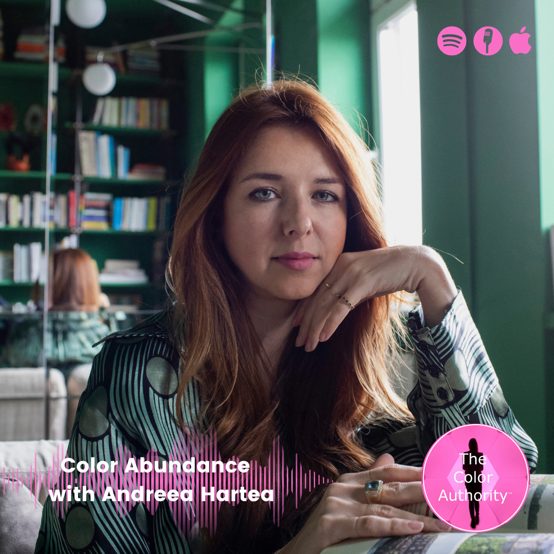
Color Abundance with Andreea Hartea
How does our past influence the perception we have of our world today? Where does color stand in our daily perception of things and more importantly, how do we select the correct colors that truly make us feel good? Andreea Hartea will explain how we perceive color and how to select the right color for ourselves and our clients.
Andreea Hartea was born in Romania and currently lives and works in Italy where in early 2020, she established RAH Colour Consulting Studio collaborating with architecture firms, interior designers, and international companies. She studied Visual Arts at NABA and completed a two-year program in Dynamic Hypnosis and Analogical Psychology at the CID_CNV Institute in Milan. To deepen her expertise, she pursued additional courses on color by "Max Luscher," attended seminars on meditative and hypnotic practices, while she researched topics like neuromarketing and neuroeconomics.
Her research primarily draws inspiration from psychology and consciousness, focusing on the mechanisms of unconscious and emotional perception. Her fascination with the human experience fuels her exploration of the inner universe as a means to comprehend our surroundings.
She derives great satisfaction from assisting individuals in their daily lives and uncovering the underlying reasons behind their experiences using the power of color.
Her primary objective is to educate people on approaching color from a more intimate, authentic, and conscious standpoint, acknowledging that color affects each individual in a very unique manner. Currently, she is devoted to promote the concept "subjectivity of color” as she has been privileged to deliver lectures to prominent companies and international platforms such as Edison, PPG, Archiproducts, and TedxRoma.
Having moved from theory to practical application, she developed the RAH Colours test, which aids professionals closely engaged with end clients in addressing the challenging question: "What color should we choose?" Whether it involves materials, products, or surfaces, this question invariably arises in interior design and often proves a point of frustration for both professionals and clients alike.
She provides guidance on implementing this methodology, and currently works on creating a platform that will provide professionals with their own personal color consultant.
Moreover, she collaborates with studios and boutique agencies specializing in brand identities, particularly for small-scale brands.

Color Statements with Claudia Cándano
What is happening in the world of fashion, what colors prevail and where does Mexican fashion stand in all of this? Claudia Cándano talks about her passion for fashion and how she incorporates color at ELLE while she is key on taking fashion to a broader audience.
With more than 14 years of experience in the world of fashion and lifestyle journalism, Claudia Cándano began her career at InStyle Mexico as Fashion Editor, where she headed one of the most successful and proactive fashion teams in the Mexican publishing industry. This experience and the consolidation of her own iconoclastic style led her to the direction of the fashion area of ELLE Mexico, and later, as Editor in Chief of ELLE Mexico, as well as ELLE Decoration and ELLE Man where she has given an important turn to the communication of the media. She has built a team recognized as one of the best in the Mexican publishing industry. Claudia has also excelled as a stylist for various celebrities and has given creative advice to designers for the creation of their collections. She studied Graphic Design at the Universidad Iberoamericana in Mexico City and her unmistakable signature has been continuously perfected with renowned courses, such as Fashion Studies at Parsons The New School for Design, in New York. Art Direction for Fashion and Fashion Journalism, at The University of the Arts, London Central Saint Martins, in England.
Claudia led for 4 years the efforts of the successful project Mexico Diseña by ELLE, as project director and jury leader of the TV series with the same name. From her efforts in different platforms, she created Hablemos de moda #ELLEPodcast, the first fashion podcast in Mexico.
Thanks to her trajectory, she continues as Editor in Chief of ELLE, but also serves as Editorial Director of Grupo Expansión's soft news brands, being in charge of media such as Quién, ELLE, ELLE Decoration, ELLE Man, Aire and Life & Style. She is also in charge of the group's Branded Content area.

Shaping Color Moods with Ruxandra Duru
Ruxandra Duru is the creator of Color Moods, a tool that shows you how to create color combinations but also how color influences your mood. In this conversation Ruxandra will testify to the power of color and the effects it has on our emotions, feelings and decisions.
Ruxandra Duru researches, documents and experiments with color, beauty and mood.
She currently lives and works in NYC. A third culture person, she was born in Romania, spent her childhood in Morocco, moved during her teens to Canada and in her mid-twenties to Barcelona, Spain where she resided until 2021.
She worked in the editorial graphic design field until 5 years ago, when she became increasingly interested in how colors, among others properties, can create different atmospheres and improve our well-being in a variety of contexts including graphic design, art and architecture.
On top of her own practice, she also uses her color knowledge at Google NYC.
Additionally, she makes music and takes photographs, spaces where mood is also an important element.

Hyperbolic Color with Serena Confalonieri
Known for her colourful designs, Serena Confalonieri explains what inspires her and the important role that color plays in creating community, safety and change in neighbourhoods. Serena loves to break taboos in the world of design as she talks about controversial topics in our society.
Milan-based designer and art director Serena Confalonieri works in the field of product, interior, graphic, and textile design, collaborating with companies and artisans of excellence both in Italy and abroad. Her strongly distinctive style is built around a graphic, colorful, and emotional vision, mixed with decorative hyperboles and geometric shapes. Unexpected subjects, chromatic and material combinations, together with anthropomorphic and zoomorphic inspirations, give life to projects where design is given an ironic twist and, vice versa, playfulness is at the root of the project.
Each project starts from an accurate research, which investigates the meaning and history of all elements involved while giving them a personal and fresh new interpretation. In particular, in-depth researches on surfaces are very crucial, in order to obtain impeccable results and a strong consistency with patterns, decorations and colors.
After graduating in Interior Design at Politecnico di Milano, Serena Confalonieri spent some time abroad, first in Barcelona and then in Berlin, where she collaborated with interior and graphic design studios. Over the first few years of her career, she also worked with several studios in Milan, plus with the Politecnico Faculty of Interior Design.
In 2013 she made her debut at Milan Design Week with a selection of products born from the collaboration with companies such as cc-tapis, Nodus, and Wall & Decò. Ever since then, she has been working for leading design and furniture companies including: Abate Zanetti, Altreforme, Archiproducts, Arzberg, Azimut Yachts, Carpet Edition, cc-tapis, Coin Casa Design, Comune di Milano, Crate & Barrel USA, .ex- novo, Fondazione Cologni, Gur, Holland & Sherry USA, Houtique, Karpeta, L'Opificio, Maliparmi, Mason Editions, Medulum, Mohebban, My Home Collection, Myyour, Nodus, Porro, Portego, Potocco, Saba Italia, Sambonet, Swatch, Texturae, Vetrofuso, Wall & Decò.
She has been the art director of design brand and realized many site specific set-ups and installations on behalf of the Municipality of Milan, Archiproducts, Marmomac Fair, and the San Siro Milan Hippodrome on the occasion of the "Leonardo Horse Project".
Alongside important institutions such as Triennale Milano, Fondazione Cologni, Michelangelo Foundation, Coin Casa and Elle Decor, Mexico Design Week, she took part in many projects characterized by the aim of guiding small and extraordinary artisanal realities towards more contemporary designs and products, in order to save and bring to light a know-how, otherwise at risk of extinction.
Serena has been selected for several design residencies and workshops both in Italy and abroad (USA, Mexico, Portugal). Her projects have been featured in many important publications and trade magazines (The New York Times, Corriere della Sera, Il Sole 24 ore, Wallpaper, Interni, Ottagono, L'Officiel, Elle Decor ...); also, she has received prestigious awards including two Honorable Mentions at the Young & Design Awards and the German Design Awards. Her works have been exhibited in well-respected design addresses such as the Milan Triennale and the Rossana Orlandi Gallery.

Speaking Material with Chris Lefteri
Chris Lefteri invites us to the mysterious world of CMF. How do you bridge the gap between material industries and designers. Why does the material come first in the creative design process and what role does color play? What innovation is happening in the intrinsic world of materials and how does this relate to topics of circularity and recyclability? Material guy Chris Lefteri gives insight on how he builds stories around materials and the challenges he encounters in a world in search of sustainable materials.
Chris Lefteri is an internationally recognised authority in materials and their application in design. The work of his studio and publications have been pivotal in changing the way designers and the materials industry consider materials. His books include Materials for Design and six other titles in the Materials for Inspirational Design series. Chris Lefteri Design has locations in London and Seoul and works with multiple Fortune 100 companies. His studio is widely recognised as one of the leading studios working in the field of materials & CMF. In 2018 he launched FixIts, his first materials driven brand.

“Excellent series about color. It’s a complex topic and Judith approaches it from a variety of angles with her guests. Always entertaining and insightful. I look forward to listening to each episode and learning something new about color and the visionaries in the color world.”
— Review Apple Podcast