An inspiring podcast on everything you need to know about color!
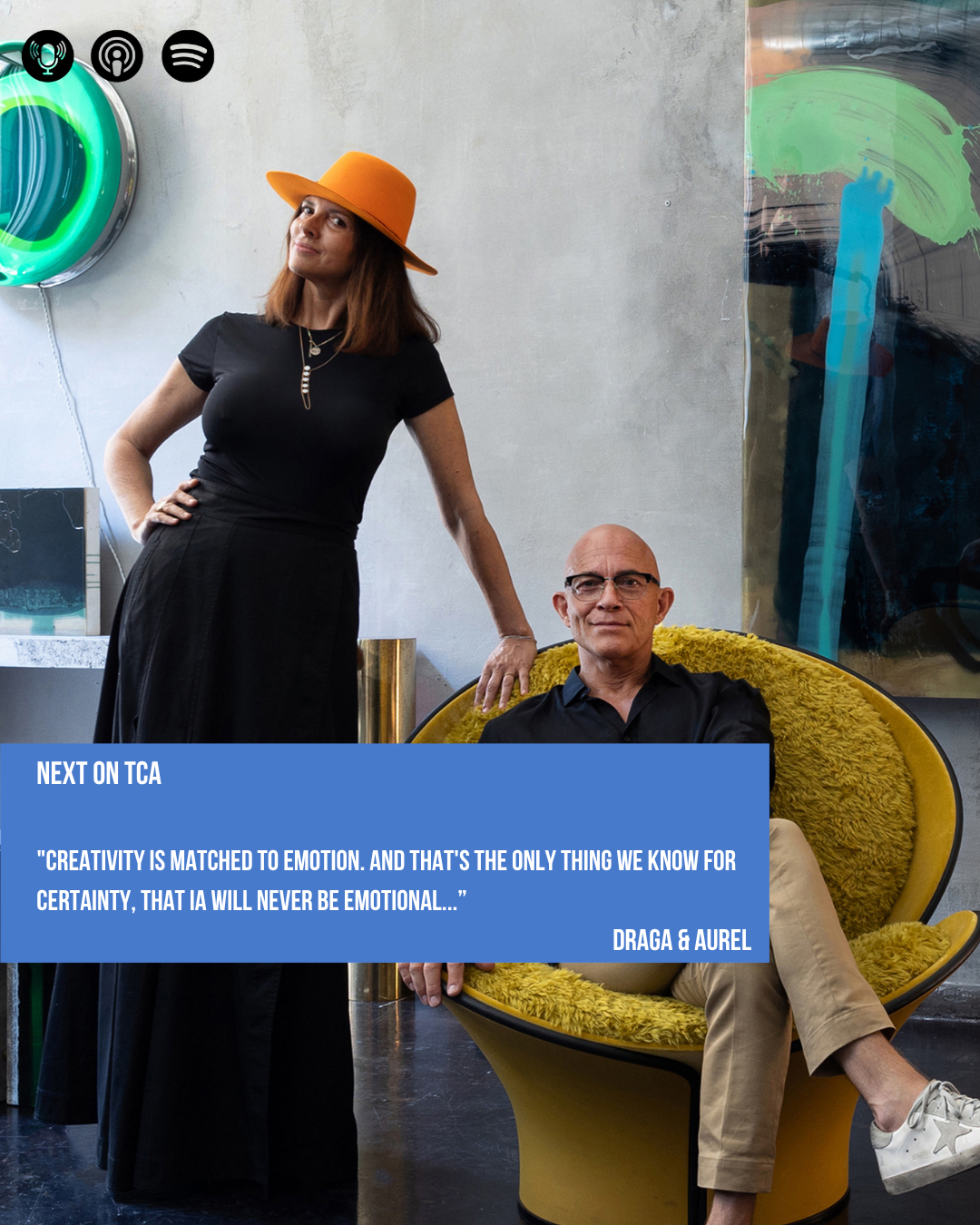
Our next episode is with Draga & Aurel, a multidisciplinary studio working across art, collectible design, and product design, based in Como. They will talk about the synergy within their partnership and their materials of choice. Out end of June.
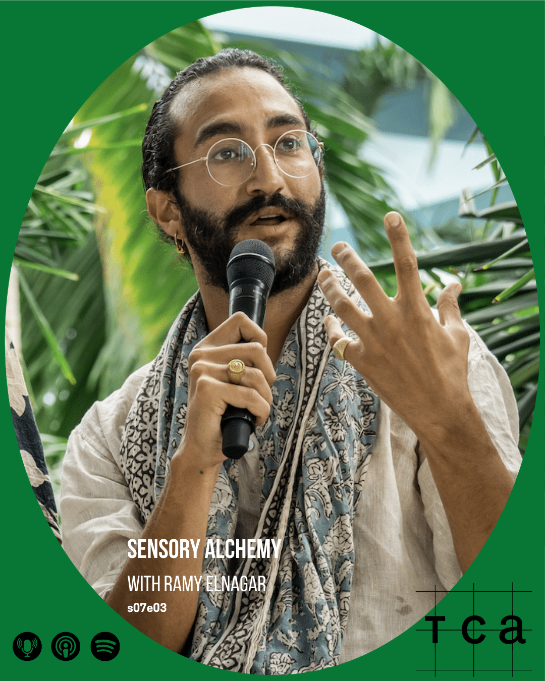
S7E03 Sensory Alchemy with Ramy Elnagar
This episode features Ramy Elnagar, founder of White Mirror, talking about how color acts as a frequency and a sensory tool to bridge the gap between our inner and outer worlds. Ramy elaborates on his studio's philosophy of "experiences as medicine," which utilizes nature-inspired awe and sensory congruence to move beyond mere engagement toward profound physiological and psychological transformation. The conversation explores the future of "secular spaces of worship" ultimately advocating for intentional design that helps individuals navigate loneliness and environmental anxiety through clarity, quietude, and ritual.
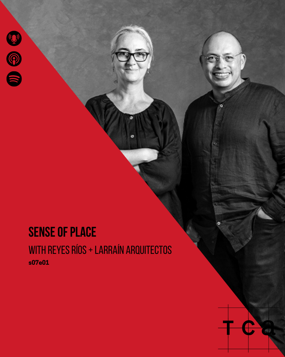
S7E01 Sense of Place with Reyes Ríos + Larraín Arquitectos
This first episode of 2026 of The Color Authority podcast features an in-depth conversation with Salvador Reyes and Josefina Larrain of the Mérida-based studio Reyes Rios + Larrain Arquitectos. The discussion centres on the studio’s philosophy of "living heritage," where they restore historic Yucatecan haciendas and manor houses not as static monuments, but as functional, contemporary spaces that preserve ancestral knowledge and memory.
Design Studio based in Mérida, Yucatán, Mexico, founded by architect Salvador Reyes Ríos and Josefina Larraín Lagos. Since 2001, they have equally devoted themselves to contemporary architectural design and restoration of old haciendas, manor houses, buildings, and heritage sites, adapting them for new, compatible uses. A local and modern sensibility, combined with a comprehensive approach to architecture, interior design, furniture, landscaping, and construction coordination, characterizes their new buildings and restoration/reuse projects. Other contributions to Mexican architecture include the revival and reinterpretation of local materials and techniques, such as Chukum-based mortar and structural concrete blended with red earth known as kancab. Reyes Ríos + Larraín are also recognized for creating an original architectural language that has shaped the contemporary identity of Yucatán’s built environment, as well as the ongoing experimentation with local materials and processes. Their work has been featured in specialized books and magazines across the United States, Europe, Asia and Latin America, earning both national acclaim and international visibility. The book Place, Matter, and Belonging, published in two editions by Arquine in 2017, is the first monograph dedicated to their body of work. The studio is currently designing projects in Mexico, United States and Dominican Republic.

S6E06 Decolonization of Color with Mohamad Baitie
In this very frank and open conversation Mohamad Baitie talks about how color reflects cultural heritage, the decolonization of design, and the desire to be seen. This podcast is a look into Middle Eastern aesthetics challenging Western norms and reclaiming visual identity.
With a master’s Degree in interior architecture, Mohamad Baitie has an expansive knowledge of color, color forecasting, color design and architectural coatings. Mohamad was born in Lebanon and grew up in Accra, Ghana, constantly moving with the family and being exposed to different cultures. His first encounter with color came through a dual interaction, Smarties and Lego. He was constantly amazed by how color shapes objects and defines the way we interact with them. Architecture was his obvious choice, where color, light and shadow are intertwined.
Today, with over 22 years of experience in marketing and communication in the paint industry, working for one of the top multinational paint brands as Business Development Director, GLC Paints. He has led the brand identity transformation of GLC Paints and is thoroughly involved in product research and development within the organization. He also took the role of professor of Color at the American University of Cairo, teaching color theory, color practice and color psychology. As part of the CMG organization, through GLC Paints, he attends the yearly global summit on color forecasting and does his own color talks and color workshops within the MENA region.

S6E05 Trend Curation with Cécile Poignant
This episode is filled with information on intentional trends within a variety of industries yet with a special focus on the culinary industry. Cécile talks to us about how the the trend forecasting industry has changed with the current speed of information reaching us and how this has resulted more in trend provocation whereas there is a great need for trend curation to truly help out businesses in finding answers in a difficult economical climate.
Cécile Poignant is French, born and raised in Paris. She is a futurist specializing in contemporary lifestyles for the past 35 years. Her expertise lies in detecting weak signals and connecting the dots to anticipate major future shifts. She has worked with international brands such as Nissan, Swatch, Philips, L’Oréal, and P&G. Always on the lookout, she observes and deciphers emerging needs and evolving behaviors.
Cécile is also actively involved in international conferences and frequently conducts workshops for professionals. She loves teaching and sharing her insights at various institutions, including IFM, ENSAD, and the American University of Paris.
Her greatest passion is curiosity—she is constantly seeking to better understand the world around her. You’ll often find her sipping an excellent Japanese green tea, savoring high-quality dark chocolate, or immersed in a book. Nature is her ultimate source of rejuvenation; in another life, she might have been a landscape designer.

S6E04 Milano Unfolded with Evelien Reich
Together with design hunter Evelien Reich, we dive into the essence of Milan Design Week 2025. She shares her favorite installations, the standout colors, materials and textures of the week,. Which are the key themes that defined this year’s edition and how has Milan Design Week changed over the past years? Listen to our conversation on all that is Milano!
Evelien Reich is the editor-in-chief of MANERA Benelux, a new English-language addition to the MANERA family, that is set to launch in September. With a decades-long career in media, she has built up extensive expertise in design and interiors. Evelien is a sought-after host at design events and is known for her sharp eye and deep understanding of interior aesthetics. She has a particular passion for the power of color in homes—how it shapes atmosphere, brings joy, and makes spaces feel alive.

S6E03 Color Down Under with Bree Banfield
Australian Bree Banfield shares with us her passion for color surprises in interiors, how color comes intuitively to her and how the light down under changes the color game completely. Listen to our conversation and receive valuable insights to the color selection process for home interiors.
With an extensive career spanning 30 years, Bree Banfield is an Interior Designer renowned for her expertise in trend forecasting and styling. A maestro in color, Bree approaches each project with a commitment to creating aesthetically appealing and emotionally rich spaces. Her projects, marked by surprises in color, pattern play, and innovative use of scale, reflect a passion for gently pushing boundaries and intuitively understanding her clients' brief. Beyond her role as an Interior Designer, she stands as a visionary trend forecaster, shaping the contemporary landscape of Australian interiors with her forward-thinking aesthetic.

S5E10 Color Devotion with Maye Ruiz
In this final podcast for 2024, TCA spoke to interior designer Maye Ruiz, the Mexican queen of color about the perfect color combination, listening to the genius loci of a house, breaking color myths, imposter syndrome, and how color is her religion in life.
Maye Ruiz, the creative mind and founder of MAYE, an interior design studio established in 2021, has rapidly established herself as a trailblazer in the design industry. A proud graduate of Universidad de la Salle Bajío in 2008, Maye combines her solid academic foundation with a visionary approach to interior design. In 2023, she was awarded by Architectural Digest and named one of the 100 most influential creatives in Latin America. Her accolade for Best Restaurant Design further solidified her reputation as a visionary in interior design. Her projects have been featured in prestigious design publications, including Dezeen, Architectural Digest (AD), and Elle Decor, highlighting her bold and distinctive approach to color and style. Maye’s work is celebrated for its trend-setting aesthetics and unlimited creativity, continuously shaping the future of the design industry. Beyond these recognitions, Maye has collaborated with renowned creative partners and brands, further elevating her position as a leader in her field.
Her commitment to pushing design boundaries and delivering excellence continues to set her apart as an innovator and influencer in interior design. In addition to leading MAYE, Maye Ruiz has passionately shared her expertise in design through academia. From 2015 to 2022, she taught courses, delivered lectures, and conducted workshops at prestigious Mexican institutions, including the Universidad Iberoamericana, Tecnológico de Monterrey, and Centro de Diseño, Cine y TV. She also collaborated on the diploma program for the Latin American adaptation of content by the renowned U.S. publisher Condé Nast, further enriching the region's design education landscape.

Brutal Honesty with Zuzanna Skalska
With Zuzanna we talk about just everything that is strategic design thinking to how to get out of our comfort zone to color-matching in plastics, to being the only woman in the room and how businesses need to understand that their brand is made of people. And all that while being brutally honest.
Zuzanna started her career in 1998 at Philips Design and for years she contributed with SignalS of Change analyses to international visionary design projects. Then for almost 15 years she was involved in Design Management & Trends consultancy at a leading Dutch design consultancy Vanberlo (today part of Accenture Industry X.O). Since 2014 she has been a founding partner of 360Inspiration, working for clients from various industries, including many blue chips and market leaders. Zuzanna's core expertise areas include Up-Front Innovation, Industry’s Cross-fertilization, SignalS of Change and Strategic FutureS Thinking. Her research and consulting activities concentrate on 8 crucial industry fields: CE, DAP, Home, Healthcare, Mobility, FMCG/Retail, Urban and Finance. She works closely with CEOs and decision makers on strategic scenario’s development as well with R&Ds/in-house creative teams on specific projects. With almost 25 years of experience Zuzanna skillfully translates her knowledge into actionable innovative programs, using many of her own, self-developed tools. Simultaneously, she has been engaged in promotion of creative industry as Member of the Board and then Advisory Board member of Dutch Design Week as well in the international design education, as a lecturer at TU/e University in Eindhoven and at Parsons School of Design in New York. She is a co- founder of School of Form – a design academy in Poland.
Skalska has been a jury member at many prestigious design competitions like IF Design Awards and a keynote speaker at many recognized business conferences and economic summits. She is an active journalist and contributing editor to leading design and lifestyle magazines. In addition, together with her partners Greenhat Innovation and Blue Media/Autopay, she publishes an annual book - a comprehensive volume on SignalS of Change research.Her professional and public activity has been often recognized not only by the prestigious world’s design awards. In addition, in recent years she has been granted prestigious titles, such as one of the 50 most influential women of Eindhoven region, one of the strongest contributing expats in Eindhoven or one of the best professional speakers in Poland. Born in Warsaw, Poland, Zuzanna has been living in the Netherlands since 1992.
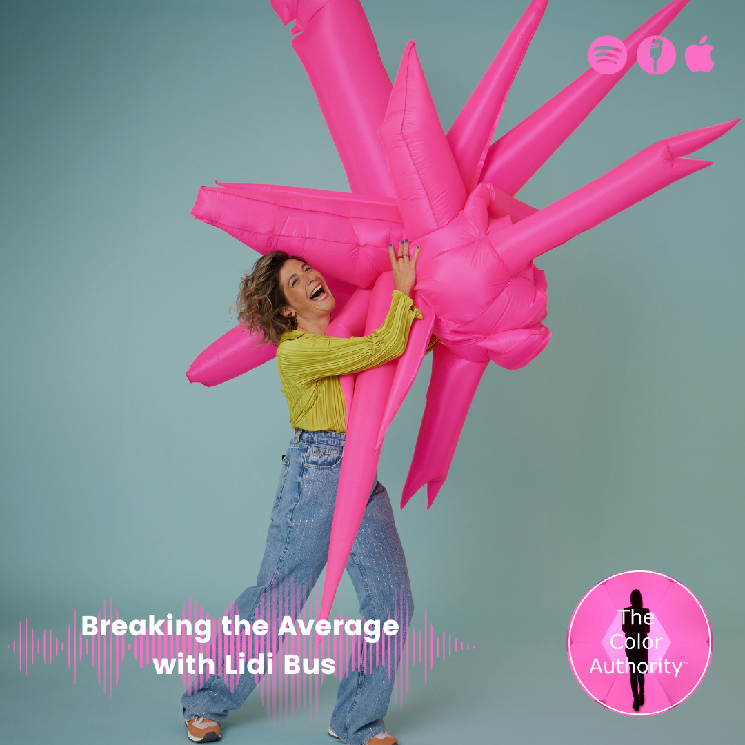
Breaking the Average with Lidi Bus
It is always super fun to talk to fellow Dutchies. Lidi Bus talked about her journey as an artist, how she came about her inflatable design and their colorful combination but also about vulnerability and her quest to break free from average.
Born Dutch, Lidi designs and fabricates unique inflatable props and set pieces, definitely not modern art to be stared at in silence. Her creations are striking expressions of applied art aimed at fashion, interior design, product presentations, photo shoots and events. Inflatable items with specific dimensions and colors can be created on request. Break free from average is her motto and she certainly does.
Lidi Bus inflatables serve as an extension for storytellers to help them create eye-catching presentations. They resonate with creators who see value in an exceptional approach, and seek to stand out from the crowd. Exclusive, bold and unique. Lidi embraces extraordinary projects, far removed from the mundane, making a statement: average is simply not enough.
The very essence of her work is based on a mix of observation, gathering useful and interesting working materials as well as ongoing research into the technical details, including the inflation system and intricate details of finishing. It is from this playful approach that the rough ideas emerge and are then carefully filtered: from broad to narrow, making room for the true concept and final result.

Cinematic Emotions with Ilya Viryachev
How is designing color for animation and cinematics different than for physical products and spaces? Ilya will bring us along his journey in the world of games and animation as he explains how he applies storytelling through color in cinematic scenes. How do you create the unexpected through color while creating the right atmosphere for a scene? How do you use color to evoke emotion?
Ilya Viryachev is an artist born in Almaty, Kazakhstan, who has spent his formative years in Vancouver, Canada and now living in Los Angeles, California.
After having graduated from the Art Institute of Vancouver, Ilya worked as an animator on multiple TV shows and later transitioned into the Concept Art field. After working as an Art Director in the animation industry for a number of years, Ilya’s latest journey took him to Blizzard Entertainment to lead a team of Visual Development artists to create new cinematics. While that keeps him busy during the day, he spends most of his free time on traditional painting, podcast, travel, murals, and being involved in the local art community.

Hyperbolic Color with Serena Confalonieri
Known for her colourful designs, Serena Confalonieri explains what inspires her and the important role that color plays in creating community, safety and change in neighbourhoods. Serena loves to break taboos in the world of design as she talks about controversial topics in our society.
Milan-based designer and art director Serena Confalonieri works in the field of product, interior, graphic, and textile design, collaborating with companies and artisans of excellence both in Italy and abroad. Her strongly distinctive style is built around a graphic, colorful, and emotional vision, mixed with decorative hyperboles and geometric shapes. Unexpected subjects, chromatic and material combinations, together with anthropomorphic and zoomorphic inspirations, give life to projects where design is given an ironic twist and, vice versa, playfulness is at the root of the project.
Each project starts from an accurate research, which investigates the meaning and history of all elements involved while giving them a personal and fresh new interpretation. In particular, in-depth researches on surfaces are very crucial, in order to obtain impeccable results and a strong consistency with patterns, decorations and colors.
After graduating in Interior Design at Politecnico di Milano, Serena Confalonieri spent some time abroad, first in Barcelona and then in Berlin, where she collaborated with interior and graphic design studios. Over the first few years of her career, she also worked with several studios in Milan, plus with the Politecnico Faculty of Interior Design.
In 2013 she made her debut at Milan Design Week with a selection of products born from the collaboration with companies such as cc-tapis, Nodus, and Wall & Decò. Ever since then, she has been working for leading design and furniture companies including: Abate Zanetti, Altreforme, Archiproducts, Arzberg, Azimut Yachts, Carpet Edition, cc-tapis, Coin Casa Design, Comune di Milano, Crate & Barrel USA, .ex- novo, Fondazione Cologni, Gur, Holland & Sherry USA, Houtique, Karpeta, L'Opificio, Maliparmi, Mason Editions, Medulum, Mohebban, My Home Collection, Myyour, Nodus, Porro, Portego, Potocco, Saba Italia, Sambonet, Swatch, Texturae, Vetrofuso, Wall & Decò.
She has been the art director of design brand and realized many site specific set-ups and installations on behalf of the Municipality of Milan, Archiproducts, Marmomac Fair, and the San Siro Milan Hippodrome on the occasion of the "Leonardo Horse Project".
Alongside important institutions such as Triennale Milano, Fondazione Cologni, Michelangelo Foundation, Coin Casa and Elle Decor, Mexico Design Week, she took part in many projects characterized by the aim of guiding small and extraordinary artisanal realities towards more contemporary designs and products, in order to save and bring to light a know-how, otherwise at risk of extinction.
Serena has been selected for several design residencies and workshops both in Italy and abroad (USA, Mexico, Portugal). Her projects have been featured in many important publications and trade magazines (The New York Times, Corriere della Sera, Il Sole 24 ore, Wallpaper, Interni, Ottagono, L'Officiel, Elle Decor ...); also, she has received prestigious awards including two Honorable Mentions at the Young & Design Awards and the German Design Awards. Her works have been exhibited in well-respected design addresses such as the Milan Triennale and the Rossana Orlandi Gallery.

Speaking Material with Chris Lefteri
Chris Lefteri invites us to the mysterious world of CMF. How do you bridge the gap between material industries and designers. Why does the material come first in the creative design process and what role does color play? What innovation is happening in the intrinsic world of materials and how does this relate to topics of circularity and recyclability? Material guy Chris Lefteri gives insight on how he builds stories around materials and the challenges he encounters in a world in search of sustainable materials.
Chris Lefteri is an internationally recognised authority in materials and their application in design. The work of his studio and publications have been pivotal in changing the way designers and the materials industry consider materials. His books include Materials for Design and six other titles in the Materials for Inspirational Design series. Chris Lefteri Design has locations in London and Seoul and works with multiple Fortune 100 companies. His studio is widely recognised as one of the leading studios working in the field of materials & CMF. In 2018 he launched FixIts, his first materials driven brand.

Shining your Light with Judith van Vliet
This is quite the unusual podcast for me.. as for the first time I am being interviewed myself by Keith Recker who beseeched, almost begged me to let the TCA fans get to know me better by turning the tables and allowing myself to be the interviewee. This fun conversation gives some insights into the mysterious world of color forecasting and its future, how you may identify color for clients and their brand but most importantly, what color can do for you on a personal level once you learn how to work with it. Color is life, color is emotion and above all, it is power.
Judith was born in 1981 in the countryside of The Netherlands. She moved to the urban environment of The Hague for her studies at the age of 17. At 28, when she moved to Milan, she fulfilled a lifelong dream of living in Italy. She still lives there, a participant in the vibrant unfolding of color and design-thinking in one of the world’s creativity capitols.
Her initial dive into color came in her first job as Product Planning Specialist at Kawasaki Motors, where she was the only European and the only woman on Kawasaki’s Japan-based design team. Later, she served as Senior Color Designer at Avient ColorWorks, which designs innovative and increasingly sustainable polymer-based colorants to the manufacturing sector and was Creative Director of ColorForward, a global color forecasting guide. These positions allowed her to travel the world to present social and consumer color intelligence to cross-industry professionals, designers and marketers.
Today she is captain of her own ship as founder and color intelligence provider at The Color Authority. She’s also vice president of membership of the Color Marketing Group, where she’s been very active for over fifteen years in positions including president and member of the executive committee.
Thank you for listening! Follow us through our website or social media!
https://www.thecolorauthority.com/podcast
https://www.instagram.com/the_color_authority_/
https://www.linkedin.com/company/78120219/admin/

Shooting Color with Ellen Mirck
How did a Dutch fashion stylist end up in the Milan and how does she mix her northern upbringing and style with the Italian? Ellen tells her story through her styling work around the world using color, fabric and texture to create luxurious yet cool stylings. She loves mystery which can clearly be seen through her work for Vogue Arabia. Ellen explains what intrigues her so much about fashion and how color fits into that world.
Ellen Mirck is a Dutch Fashion Stylist and sustainable editor based in Milan. She does fashion styling, art direction and brand consultancy. She is contributing editor of Vogue Arabia and also collaborates with magazines such as Vogue Brazil, Lampoon, Numerò Netherlands, Tank and Cap74094.
Her clients are Burberry, Max Mara, Hogan, Pomellato, Moncler, Ermenegildo Zegna, Fay, Tommy Hilfiger, Bvlgari, Converse, Benetton, Tod's, Bally, Palm Angels and many more.
Ellen used to live in London and work for Alexander McQueen and Hermès. She studied Economy in the Netherlands and graduated Cum Laude in Fashion Styling at Marangoni Milan. In her work she instinctively pairs the clean, graphic lines from Northern Europe with the warmth and a certain dramatic flair found in the South. She finds the precious in the details with interesting, nature- inspired textures. As a Stylist and Art Director, she'd say she more of a storyteller, really getting into the mind of the client to translate their vision and vivid imagination that might be slumbering underneath the surface. Ellen enjoys clothes, the beauty of them, but also believes in wearing your values.
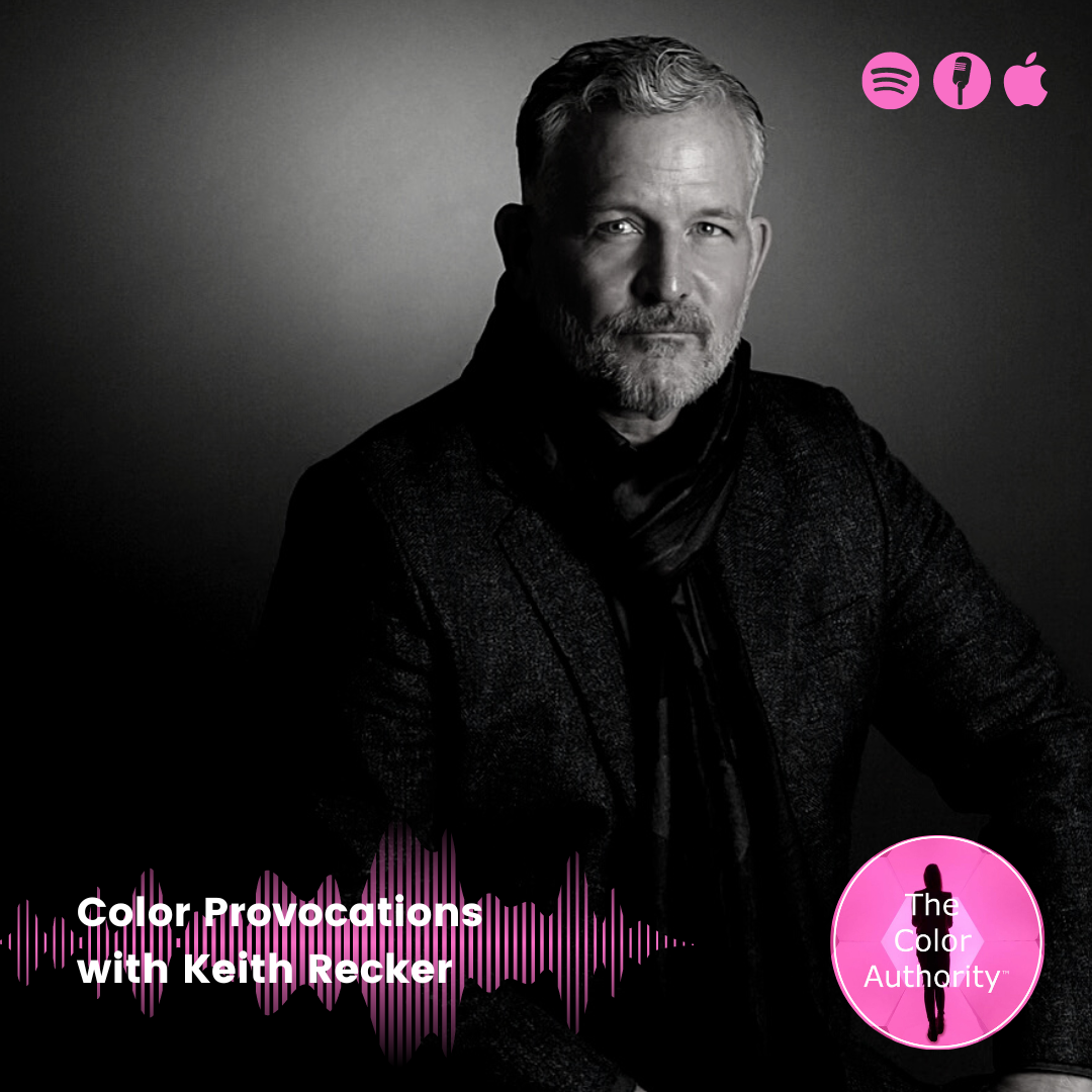
Color Provocations with Keith Recker
Keith Recker is a color poet and you will hear that immediately when listening to this conversation, even if it's not all roses we talk about. Keith does not refrain from talking about how color continues to create political and social divides and often triggers consumers into buying promises not kept by brands. The mission of his latest book Deep Color is to indeed reveal the misperceptions on color and to disclose the truth about each color in the spectrum. Not all that is white is clean, simple and pure..
Keith Recker brings 35 years of adventuresome, insightful, multicultural experience in marketing, merchandising, trend and color forecasting, and content development to his role as Editor in Chief and Co-Owner of TABLE Magazine. With strong roots in food and drink, TABLE also explores travel, interior design, fashion and jewelry, and other facets of modern living, in both print and digital formats.
Recker is the founder and editor of HAND/EYE Magazine, a print and online publication whose 10 issues cultivated a global following. The magazine profiles forward-looking creators, faraway cultures, ancient craft traditions, and cutting-edge design. HAND/EYE saw humankind’s creative future as handmade, which demands attention the struggle of artisans to earn decent livelihoods through preservation of ancient traditions, innovation of new ones, exploration of new markets, and educating the consuming public about the cultural and economic importance of their work. HAND/EYE is on a pause right now, but ripe for rebirth.
Recker is also a trend and color forecaster whose almost 20-year client list includes global influencers Pantone, WGSN, Stylus, Color Association of the United States (CAUS), and more. For 16 years, Recker has been creative director of Pantone’s annual home publication, PANTONE View Home. For eight years he was on WGSN’s global trend and color team. He serves on the CAUS home forecasting committee.
The revised second edition of his book, True Colors: World Masters of Natural Dyes and Pigments (Thrums Books) was released in September 2020, with chapters already excerpted in London-based Selvedge Magazine, NY Textile Month Journal, and reviewed in many more, including Metropolis. He is co-author of PANTONE: The Twentieth Century in Color (Chronicle, 2012), published in eight languages. His new book, Deep Color: The Shades That Shape Our Souls, debuts in September 2022. His writing on color and culture has been published by the Studio Museum of Harlem (catalog essay about Stephen Burks), Museum of Art and Design (catalog essay about African craft and its messages about the future), Brooklyn Rail (comparing the work of potter Alex Matisse with the performance work of Marina Abramovic), The Santa Fe New Mexican, and more.
He has also worked in the non-profit world as a director of consumer marketing at CARE International and executive director at Aid to Artisans (as well as a board member and volunteer for 22 years). Through his involvement with Aid to Artisans, he has worked side by side with artisans from 50 countries. He has served on the boards of Art in General, Chez Bushwick, as founding chair of The Quiet in the Land (a project which brought leading contemporary artists into communities in the developing world) , and the International Folk Art Market, where he was also pro bono creative director and head of the Marketing Committee from 1996-2020.
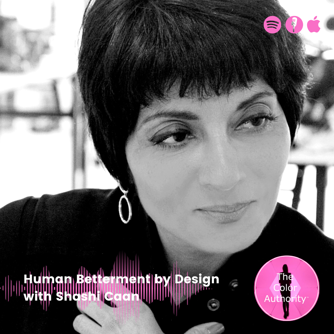
Human Betterment by Design with Shashi Caan
Shashi Caan talks about the cultural color differences among the three continents that she has lived on, the application of color in architecture and her life mission to increase human betterment through color and design in the world. From generation gaps to the main design principles to futurist thinking, Shashi Caan her passion for her profession sparks through the entire conversation. Shashi is all about collaboration and understanding what is going on in the world to find solutions to today's problems.
Shashi Caan is a distinguished thought leader for architectural design internationally. As a practitioner, design educator and author, her dedication to furthering human betterment through and by design is reflected in her 30- year design career. Co-founder and leader of THE SC COLLECTIVE (2002), the inventively structured firm, Shashi is also the Co- founder and President of Globally We Design – GloWD (2015), an independent design futures think thank, through which her ReDesignEd Educators Forum facilitated the Universal Design Education Charter in 2018 and The Johannesburg Declaration in 2019. Shashi was formerly Associate Partner and Design Director with Skidmore, Owings and Merrill (SOM), in New York and Chair of the Interior Design Department at Parsons, the New School for Design. In her service to industry capacity, Shashi also serves as Chief Executive Officer on the Executive Committee of International Federation of Interior Architects/Designers (IFI) Executive Board. She is a former two-term President for the International Federation of Interior Architects/Designers (IFI) and has been recognized as a Fellow of the IFI and Fellow of Royal Society of the Arts, UK. She holds honorary fellowships from the Australian Institute of Designers, the British Institute of Interior Design, as well as the American Society of Interior Design. Amongst others, her past volunteer and executive board level service includes the US International Interior Design Association (IIDA) , NY’s Interiors Committee of the American Institute of Architects (AIA), and the United Nations Association (UNA). She was Contract Magazine’s US Designer of the Year (2004), granted the Golden Seat Architectural Master Award of China (2012), and appointed JDP Design Ambassador to Japan (2013), this amongst her many awards and accolades for design projects and design leadership across the world. With countless published writings, her seminal book, Rethinking Design and Interiors: Human Beings in the Built Environment (2011), has been translated into multiple languages.

What is Color with Judith van Vliet
What is Color? A question I ask all my guests on the podcast and the variety of answers has been amazing. It is such a basic question yet perhaps so hard to answer as color is such a complex topic and can have so many different meanings. Listen back to what my guests replied to this important question over the past year from their own perspectives working in design, architecture, science, food and psychology.

Color Kindredness with Patti Carpenter
Patti Carpenter will talk color trends as she travels the world to places that inspire her. Actually, it is not the places that inspire her, it's the indigenous and how they work color in their artisan products from which we all can learn so much. Patti talks about what really keeps her going, her work in artisan development in countries around the world and her desire to bring more diversity to the world of design. From high Fashion to doing what truly matters to her, helping and supporting other creatives globally and bringing back the value of true artisan development. That is Patti.
Patti is Principal of carpenter + company and an award- winning Designer in globally sourced home décor, accessories, fragrance and gifts, with experience in product design and development, merchandising and color + trend forecasting. As a Micro-Enterprise specialist with U.S. presidential recognition for domestic and international expertise in artisan development, small producer and entrepreneurial training and economic development she has designed and sourced Private Label collections for Bloomingdales, Neiman Marcus, Crate & Barrel, The Phillips Collection, ABC Carpet and Home, Donna Karan Urban Zen and Ralph Lauren. She has worked in 57 countries. Patti is an expert in Color + Trend research and forecasting and consults with Pantone. She is the Global Trend Ambassador for Maison & Objet, Paris. She is an active board member of SERRV International-one of the founding organizations of the World Fair Trade Organization (WFTO), BADG (Black Artists and Designer Guild), The High School of Fashion Industries and The Bienenstock Furniture Library, as well as the co-founder of the Kaleidoscope Project. Patti is also the recipient of the Gift For Life Industry Achievement Award for 2021 and the Withit Industry Leadership Award for 2021 for the Kaleidoscope Project.
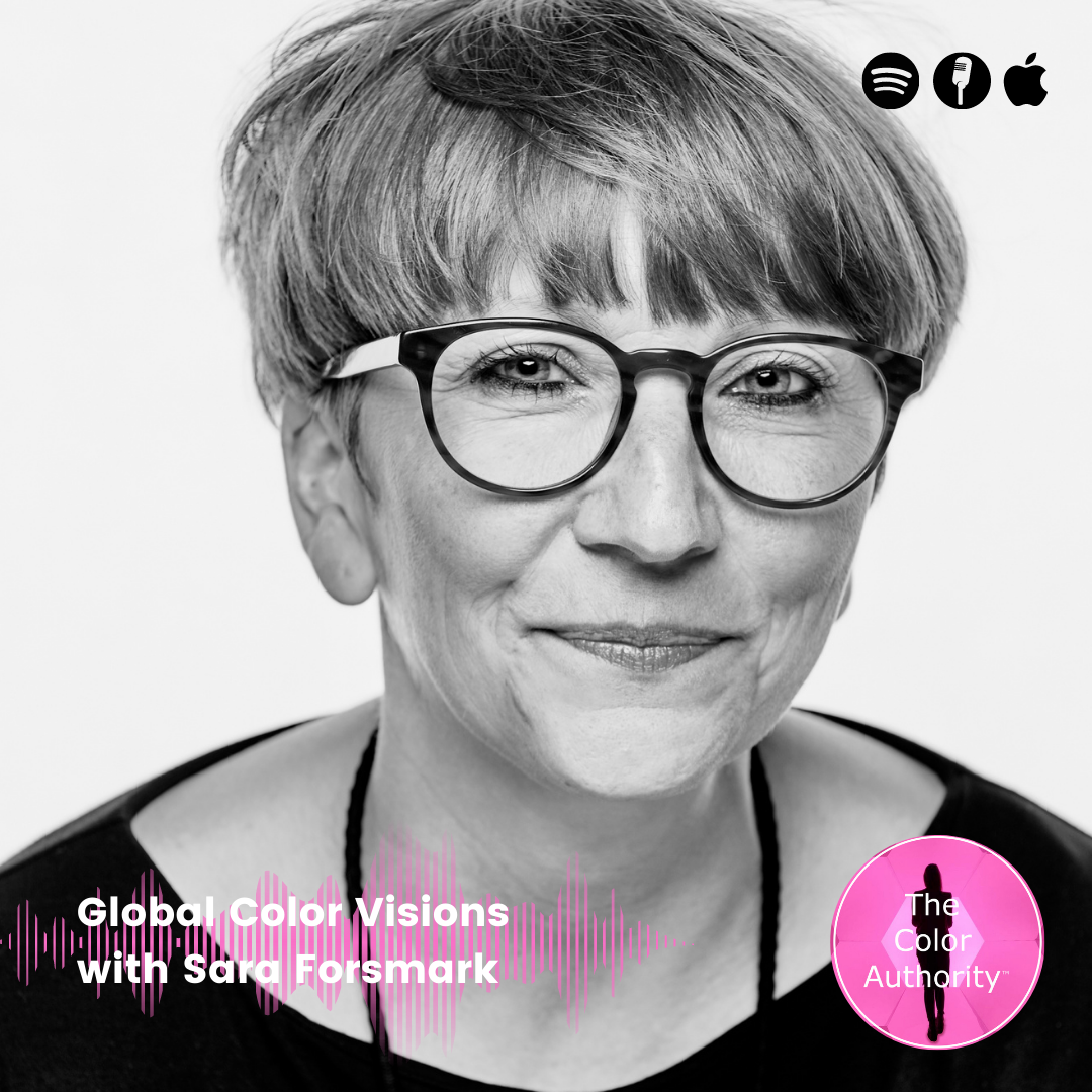
Global Color Visions with Sara Forsmark
In this candid conversation I will talk with Sara Forsmark about the great challenges of creating a global color vision for the sports performance brand Adidas. How does she incorporate topics such as sustainability and inclusivity in her colourful work? Print and pattern is key in the world of apparel and footwear, how are they materialised in color visions? Sara is a fervent color advocate but even more so when it comes to debunking color perceptions and concepts, let's listen which ones nerve her the most.
Sara Forsmark is a creative who navigates and transforms the complex world of color into future forward color concepts and visions.
For Sara, color is beauty and currency; for life, humanity, design, brands and business. With color at the core, her ambition is to be a strong voice for color by creating awareness of all its qualities; as a creator of aesthetic experiences, to shaping meaningful connections between brand, culture and its audiences, and beyond.
With a big picture view, she contextualises worldly movements and growing disruptive shifts into brand relevant color insights and content; and fuses creativity with science; to craft, drive and lead way for new authentic and purposeful color expressions and stories; that speaks brand, debunks aesthetic norms and provokes emotion towards a better and different tomorrow.
Her work experiences span across a diverse range of categories and brands, a journey that started at agencies creating CMF designs for clients as LG, Hewlett-Packard and Bowers & Wilkins, before moving into the world of sports, shaping and steering brand global creative visions for color at adidas. A color design role she currently holds in the adidas Global Creative Direction team.

Creating Design Synergies with Certosa Initiative
Founders of Certosa Initiative Margriet Vollenberg and Remi Versteeg will reveal why they are going to be the talk of Milan Design Week in this exclusive podcast interview. How is color influencing this years' Milan Design Week and how did it influence the installations at Certosa? What are the innovations we can expect in materials, design while tapping into our multiple senses? How is combining color ever more so important and what role does the absence of color play in todays' design?
Beyond Space, architects with a distinct focus on delicate interiors and grand-scale transformations, bundle forces with Organisation in Design, makers of Ventura Projects and instrumental in breathing new life into rediscovered districts of Milan. Brought together by a deeply shared passion for design, their complementary track records make them a natural match to move the crowds into the up-and-coming Certosa District. In the face of turbulent times and on such short notice, the team sees itself floated by the sheer energy of the historical moment of resuscitation and is poised to make the Certosa Initiative the Talk of the town during the 2022 Milan Design Week.
Remi Versteeg is equal parts architect and entrepreneur. He founded his first company back in 2002 (many were to follow) and obtained his degree in architecture from Delft University. In 2016, he co-founded office for architecture Space Encounters. In 2021, he co-founded Beyond Space together with Stijn de Weerd. Remi is driven to innovate and always seeks to combine diverse perspectives to forge new connections and lead him down roads less traveled.
Margriet Vollenberg is an entrepreneur and a professional in the global field of design and has over twenty years’ experience in the design industry. Margriet, founder of Organisation in Design and founder & art director of Ventura Projects, has got a grand sense of adventure on the one hand and the prudence to do business wisely on the other. She is a graduate designer who studied at the Design Academy in Eindhoven under Lidewij Edelkoort. Her company Organisation in Design (started 2005) provides clients with services design strategies, consultancy, and art direction. For 11 years she was driving force behind the successful design events Ventura Projects in Milan, Dubai, New York, and many other places all around the world.

“Excellent series about color. It’s a complex topic and Judith approaches it from a variety of angles with her guests. Always entertaining and insightful. I look forward to listening to each episode and learning something new about color and the visionaries in the color world.”
— Review Apple Podcast